One thing I’ve found annoying with the mobile Safari browser on iOS is the shadows that appear at the top of input boxes. It’s not normally too much of an issue unless you are doing fancy styling and then they can make it really messy and ugly. Fortunately David Walsh has provided a solution. I won’t repeat the solution but do post some screenshots here showing the issue and how much better it can look after applying his fix.
Example of default input styling with and without top shadow
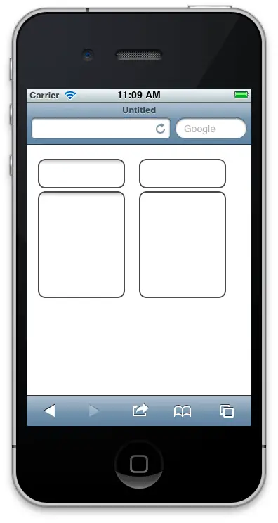
The first screenshot below is taken from the iOS Simulator using an iPhone. The input and textarea on the left are the default styling and those on the right are default styling with the shadow removed.

Using default styling, there’s nothing wrong with that top shadow but as soon as you try and do something different then it just gets ugly.
Example of stylized input box with and without top shadow
For example, take a look at the following partial screenshot taken from the Personalised Plates website homepage where the visitor can search for a plate idea:

The top shadow appears even though all the other borders etc have been switched off, and it just looks ugly. Applying David’s fix (which I’ve not yet applied to the prodction website) makes it look a lot better like so:

The solution
Now you’ve seen the before and after, go read David’s “Remove Input Shadows on iPad” post for the solution.

